async function makeScene3D(buildScene, invalidation, opts = {}) {
  const THREE = await import("https://esm.sh/[email protected]");
  const { OrbitControls } = await import(
    "https://esm.sh/[email protected]/examples/jsm/controls/OrbitControls"
  );

  const {
    width            = 620,
    height           = 500,
    cameraPos        = [6, 4, 7],
    fov              = 40,
    far              = 100,
    bgColor          = 0x111827,
    alpha            = false,
    target           = [0, 0, 0],
    minDistance      = 3,
    maxDistance      = 20,
    ambientIntensity = 1.0,
    onFrame          = null,
  } = opts;

  const renderer = new THREE.WebGLRenderer({ antialias: true, alpha });
  renderer.setSize(width, height);
  renderer.setPixelRatio(Math.min(window.devicePixelRatio, 2));
  renderer.setClearColor(bgColor, alpha ? 0 : 1);

  const scene  = new THREE.Scene();
  const camera = new THREE.PerspectiveCamera(fov, width / height, 0.1, far);
  camera.position.set(...cameraPos);
  scene.add(new THREE.AmbientLight(0xffffff, ambientIntensity));

  const O = new THREE.Vector3(0, 0, 0);

  function spriteLabel(text, cssColor, scale = 1.6) {
    const c = document.createElement("canvas");
    c.width = 320; c.height = 72;
    const ctx = c.getContext("2d");
    ctx.font = "bold 26px sans-serif";
    ctx.fillStyle = cssColor;
    ctx.textAlign = "center";
    ctx.textBaseline = "middle";
    ctx.fillText(text, 160, 36);
    const spr = new THREE.Sprite(new THREE.SpriteMaterial({
      map: new THREE.CanvasTexture(c), transparent: true, depthTest: false
    }));
    spr.scale.set(scale, 0.36, 1);
    return spr;
  }

  // ctrl is created before buildScene so the callback can configure it
  const ctrl = new OrbitControls(camera, renderer.domElement);
  ctrl.target.set(...target);
  ctrl.enableDamping = true;
  ctrl.dampingFactor = 0.06;
  ctrl.minDistance   = minDistance;
  ctrl.maxDistance   = maxDistance;

  buildScene(scene, THREE, { O, spriteLabel, ctrl });

  ctrl.update();

  let rafId;
  (function animate() {
    rafId = requestAnimationFrame(animate);
    if (onFrame) onFrame();
    ctrl.update();
    renderer.render(scene, camera);
  })();

  const container = document.createElement("div");
  container.style.cssText =
    `position:relative;display:inline-block;width:${width}px;max-width:100%;`;
  container.appendChild(renderer.domElement);

  const btnStyle = [
    "padding:4px 10px", "font-size:12px", "cursor:pointer",
    "background:rgba(30,30,30,0.75)", "color:#ddd",
    "border:1px solid #555", "border-radius:4px",
    "backdrop-filter:blur(4px)", "z-index:10",
  ].join(";");

  const fsBtn = document.createElement("button");
  fsBtn.textContent = "⛶ Fullscreen";
  fsBtn.style.cssText = "position:absolute;bottom:8px;right:8px;" + btnStyle;
  fsBtn.addEventListener("click", () => {
    if (!document.fullscreenElement) container.requestFullscreen();
    else document.exitFullscreen();
  });
  container.appendChild(fsBtn);

  function onFSChange() {
    if (document.fullscreenElement === container) {
      renderer.setSize(screen.width, screen.height);
      camera.aspect = screen.width / screen.height;
      camera.updateProjectionMatrix();
      fsBtn.textContent = "✕ Exit fullscreen";
    } else {
      renderer.setSize(width, height);
      camera.aspect = width / height;
      camera.updateProjectionMatrix();
      fsBtn.textContent = "⛶ Fullscreen";
    }
  }
  document.addEventListener("fullscreenchange", onFSChange);

  invalidation.then(() => {
    cancelAnimationFrame(rafId);
    ctrl.dispose();
    renderer.dispose();
    document.removeEventListener("fullscreenchange", onFSChange);
  });

  return container;
}PCA: the shape hidden in your data
linear algebra
machine learning
The geometry behind principal component analysis: how the covariance matrix encodes the shape of your data, and why eigenvectors are the natural axes to read it from.
An NBA scout records three measurements for every player he is scouting: height, wingspan and reach. The thing is that all these measures are highly correlated because taller players tend to have longer wingspans and higher reaches. So in practice there are three numbers (dimensions) per player, but the data could be represented with a single dimension representing the “overall size” of the NBA player. PCA finds this dimension automatically from the data alone.
How the data was generated
rng = np.random.default_rng(42)
N = 220

feature_names = ["Height", "Wingspan", "Standing reach"]
means = np.array([200.0, 205.0, 260.0])  # cm
stds = np.array([8.0, 9.0, 11.0])  # cm

# Correlation matrix: positively correlated but not perfectly
corr = np.array(
    [
        [1.00, 0.75, 0.68],
        [0.75, 1.00, 0.62],
        [0.68, 0.62, 1.00],
    ]
)

L = np.linalg.cholesky(corr)
Z = rng.standard_normal((N, 3)) @ L.T
X_raw = Z * stds + means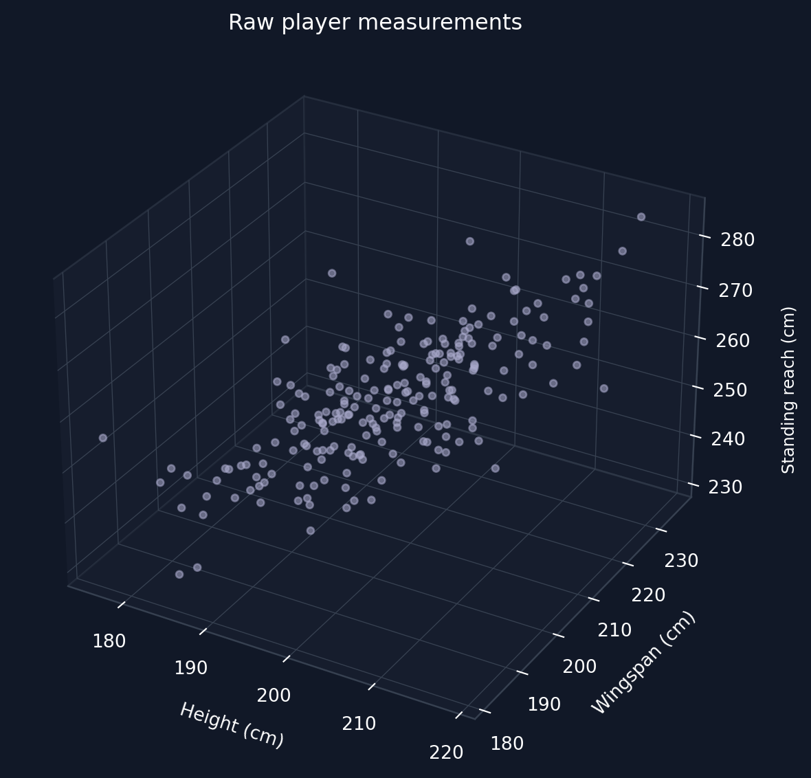
Standardising the data
For computing the PCA components, we need the covariance matrix. But for the covariance matrix, each feature needs to be standardized. The data points are standardized as
x_{ij} \leftarrow \frac{x_{ij} - \mu_j}{\sigma_j}
where i indexes the player and j indexes the feature (height, wingspan, or standing reach), \mu_j is the mean of feature j across all players, and \sigma_j is its standard deviation.
This step makes each variable have a mean of 0 and variance of 1. This makes the three axes comparable because otherwise larger units would artificially dominate the covariance matrix. The shape of the correlation stays unchanged because standardisation only rescales the values and doesn’t distort them.
The covariance matrix: encoding shape
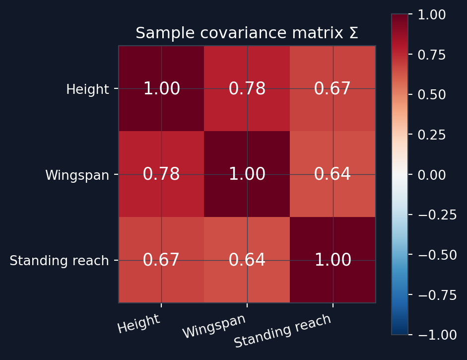
After standardising the three measurements, the sample covariance matrix is computed as:
\Sigma = \frac{1}{N-1} X^\top X
This form holds because X is already centered. Since each feature also has variance 1, the diagonal entries of \Sigma are all 1 and the off-diagonal entries are Pearson correlation coefficients. For standardized data, the covariance matrix and the correlation matrix are the same thing. Geometrically the covariance matrix encodes the shape of the data cloud. Looking at Listing 1, you can see that the sample covariance matrix is basically the same that was used to generate the synthetic data. You can see the resulting covariance matrix from Figure 3.
Eigenvectors: the natural axes of the data
An eigenvector \mathbf{v} of \Sigma satisfies
\Sigma \mathbf{v} = \lambda \mathbf{v}
In practical terms, this means that applying the matrix \Sigma to \mathbf{v} only scales the vector by a scalar \lambda and never rotates it. These eigenvectors are natural axes for the data cloud. These eigenvectors are directions along which the data varies independently with no covariance between them (orthogonal with respect to each other). The corresponding eigenvalue \lambda is the variance of the data projected onto that axis. Then sorting the eigenvalues \lambda from largest to smallest gives us the principal components in order: PC1 explains most of the variance, PC2 the next most etc. All principal components are orthogonal to each other. The full decomposition is:
\Sigma = V \Lambda V^\top
where V = [\mathbf{v}_1 \mid \mathbf{v}_2 \mid \mathbf{v}_3] has the eigenvectors as columns and \Lambda = \text{diag}(\lambda_1, \lambda_2, \lambda_3).
Figure 4 shows the three principal component arrows as eigenvectors, scaled by \sqrt{\lambda_i} to reflect the data spread better. When rotating the 3d visual, you can see that the data cloud stretches along PC1 and PC2 and PC3 explain the remaining smaller variation.
Computing the principal components
eigenvalues, eigenvectors = np.linalg.eigh(Sigma)
# eigh returns ascending order — reverse to descending
idx = np.argsort(eigenvalues)[::-1]
eigenvalues = eigenvalues[idx]
eigenvectors = eigenvectors[:, idx] # columns are PC vectors
explained_var = eigenvalues / eigenvalues.sum()
cumulative_var = np.cumsum(explained_var)
print(f"Eigenvalues: {np.round(eigenvalues, 3)}")
print(f"Explained variance:{np.round(explained_var, 3)}")
print(f"\nPC1: {np.round(eigenvectors[:, 0], 3)}")
print(f"PC2: {np.round(eigenvectors[:, 1], 3)}")
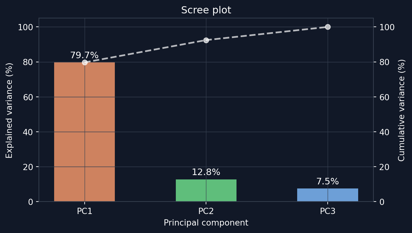
print(f"PC3: {np.round(eigenvectors[:, 2], 3)}")Eigenvalues: [2.402 0.385 0.227]
Explained variance:[0.797 0.128 0.075]
PC1: [-0.592 -0.585 -0.555]
PC2: [-0.314 -0.466 0.827]
PC3: [-0.742 0.664 0.092]Explained variance and the scree plot
Each eigenvalue \lambda_i is the variance of the data projected onto PCi. Thus the fraction of total variance explained by PCi is \lambda_i / \sum_j \lambda_j. Figure 5 shows these fractions in descending order.
Dimensionality reduction
Keeping only the first k principal components gives a rank-k approximation of the data:
\underbrace{Z_k}_{N \times k} = \underbrace{X}_{N \times p}\underbrace{V_k}_{p \times k}, \qquad \underbrace{\hat{X}}_{N \times p} = \underbrace{Z_k}_{N \times k}\underbrace{V_k^\top}_{k \times p}
where V_k contains only the first k eigenvectors and p is the number of features (3 in this case). In practice, the data is first projected down to k dimensions, then reconstructed back into the original p-dimensional space. But during the reconstruction, the data is constrained to lie on a k-dimensional subspace, so information carried by the discarded eigenvalues is lost. The reconstruction error is exactly the sum of these discarded eigenvalues:
\|X - \hat{X}\|_F^2 = \sum_{i > k} \lambda_i
What the scout found
PC1 captures nearly all variation (~80%, see Figure 5) of the three measurements. PC1 can be thought of as an “overall size” axis. PC2 and PC3 capture the remaining ~20% of the variation. The beautiful part of PCA is that all of this analysis could be done automatically with only the data set and a little bit of clever linear algebra. The method found the dominant axis automatically.